
Something you may or may not already know: I’m constantly on the search for the best team of apps that will help me get through my day. And coming from the person who can’t go into Target without buying a fresh spiral notebook, that’s saying something. My EMM (English Major Morals) have always steered me towards the more romantic option- pen & paper. But as much as I hate to admit it, I’ve slowly joined the rest of the world and have chosen efficiency over romance: Phone Organization. I’ve narrowed it down to my top two favorites.
The Do-All (Free) App: Microsoft Outlook
I first tried out an Outlook email app a year or two ago when I had a .edu email address for school. During my first experience, the app was super buggy & it froze constantly. It would say that all was synced and refreshed, but it wouldn’t actually do the refreshing. It wasn’t reliable, and I quickly deleted it.
This second time around (brought on by my dear Sunrise app coming to an end) has been a completely different experience. Totally recommend. Instant pros:
- Easy set up and compatibility with Gmail & other email providers
- Integration with Mail + Calendar + Files (i.e. DropBox, Evernote, etc.) + Contacts
- Super clean calendar interface

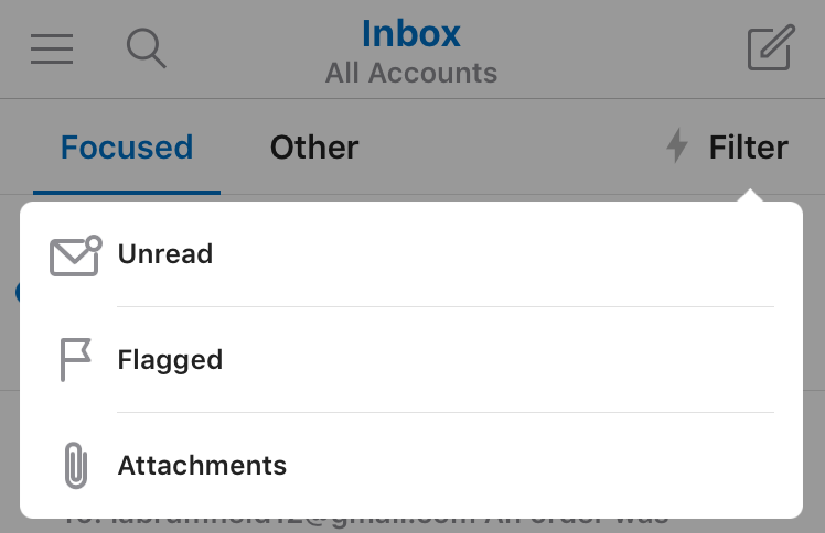
I didn’t think that I would really care about the email integration initially, but it’s actually really helpful & convenient. And the filters aren’t hard to get to or over the top specific. Your default “important” emails are displayed under the Focused column & everything else is under Other. You can then narrow messages down more by Unread, Flagged or emails with Attachments.
The calendar itself is exactly what it needs to be: clean & useful. Calendar apps can very quickly feel cluttered, which is the last thing a cluttered lifestyle needs. There’s and Agenda view (similar to Sunrise, for those of you who used that), a Day view and a 3-Day view.


In the above example, I created a mock event to give you an idea of how it’s set up. Pretty standard for creating a calendar event, but one surprising feature that I wasn’t expecting was the Skype Call integration. If you turn the feature on, you can invite a user from your contact list to a Skype call at a designated time/place. When the event is saved, a Skype call link is provided that all attendees and use the day of. Slick, right?
The right photo above is showing the Agenda view. Icons are created for users that have also been invited to the event. The app pulls in your gmail calendar categories as well (all of mine just happen to be a greenish color here, oops) and you can select which categories you want to hide at a given time. This is a make-or-break function for my calendar apps; I try to avoid viewing three versions of “Holidays in the United States” at all costs.


I also wanted to show how the calendar & files look over email within the app. In the left screenshot above, I created a calendar invite within an email draft by clicking the little calendar icon. Likewise, you can attach a document by tapping on the paperclip. 
Lastly, no more searching for attachments embedded within email chains. I didn’t even know that I needed this until I discovered that it was possible. (Haha, but actually.) Huge time saver. And as I mentioned earlier, you can filter emails based whether or not they have attachments, which also keeps things super efficient.
The Task Manager ($6.99) App: Calendars 5
While the above app combines the Calendar & Email, this app is heavy on the Calendar side of things, but also includes task lists. So at the end of the day, its really depends on how you want to use your calendar. It’s also super flexible & unique with how it handles Calendar views:

As you can see from the photo above, its pretty self explanatory. I think I much prefer the Week view, simply because of the horizontal interface:

Things to note here: the colors are helpful, not tacky (it’s a fine line, people!) | You can easily scroll through the weeks at the bottom of the app. | The three bars on the top right allow you to change views quickly and seamlessly. The red 1 icon means that you’ve got a notification. In this case, it’s the mock invitation for coffee that I had previously created (that’s also why there are two “meet for coffee” events on the calendar). Upon clicking the notification icon, this is what shows:

Love the look here, and love that it pulls the message from the original email. I can quickly accept/decline an invite by clicking either the green or red icon.
The last item that really sets this app apart from its competitors is the the “smart” event creator:


The creator starts with a blank screen. As you begin typing, the blanks are essentially filled in for you. For instance, the app new that after I typed “at” I would be giving a location. In the case above, I had typed Heri– and it pulled up locations near me. I then selected the date & time and was done. Boom!
Another consideration: Biggest competitor for Calendars 5 right now is Fantastcal 2. ($2.00 cheaper and might be worth looking into.) I ultimately chose Calendars 5 for the interface, but you can check out the pros/cons for Fantastical 2 here.