
Next stop on the OERxDomains Blogging train: the Artwork. Bryan Mathers‘ work is simply too good to not to talk about for a full post. You can also read Jim’s post about the conference aesthetic here.
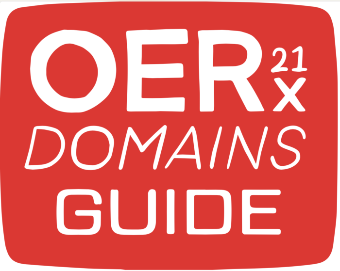
First up, the different logos. The color bars reminded me a lot of the painted bars we did for Reclaim Video, and also the header images for Domains19. It was fun to carry that through here:
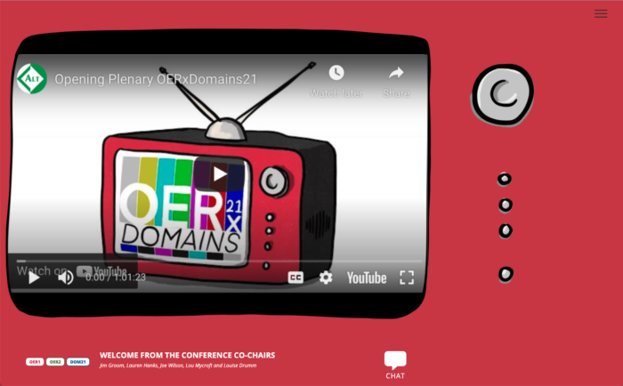
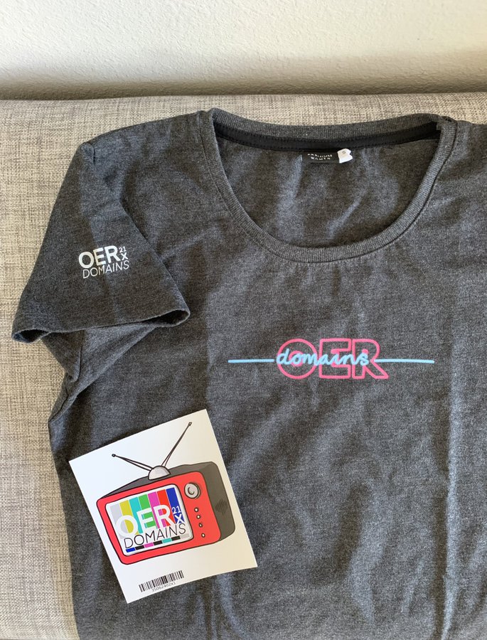
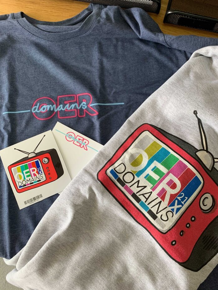
Building on the tv/video metaphor even further, the most widely used images for the event were undoubtedly the red tv boxes:
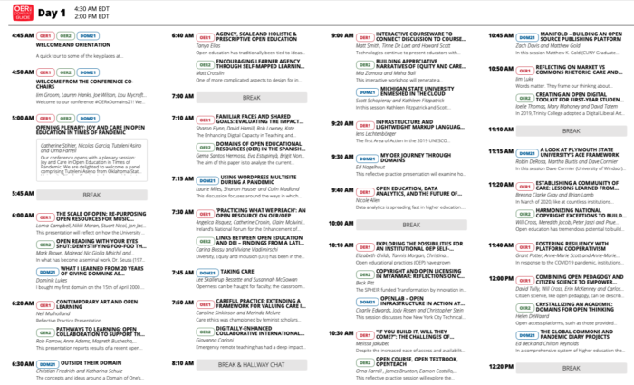
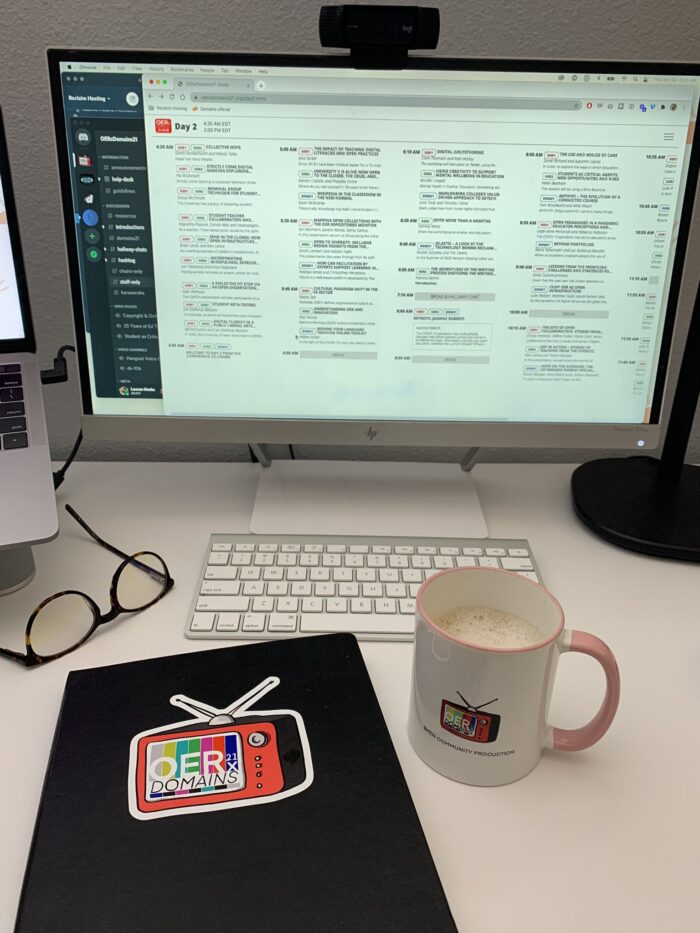
We knew that we wanted the conference schedule to embody an TV Guide in which conference participants were flipping through ‘channels’ (i.e. tracks) to watch the various presentations:
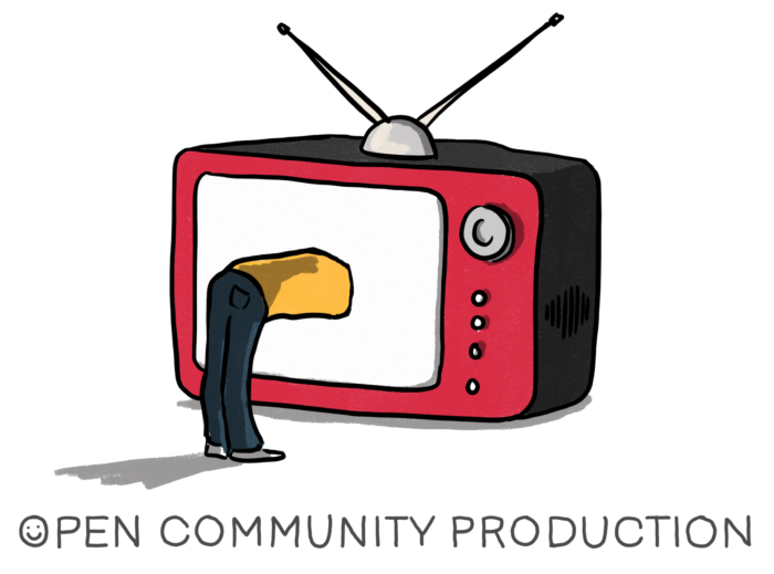
Even more, we wanted participants to feel fully immersed in the conference, almost like they were jumping into the tv screen themselves to participate. To join along, and make it a full-blown community production:
This also let to animated jingles that quickly became the intros and outros for each ‘episode’:
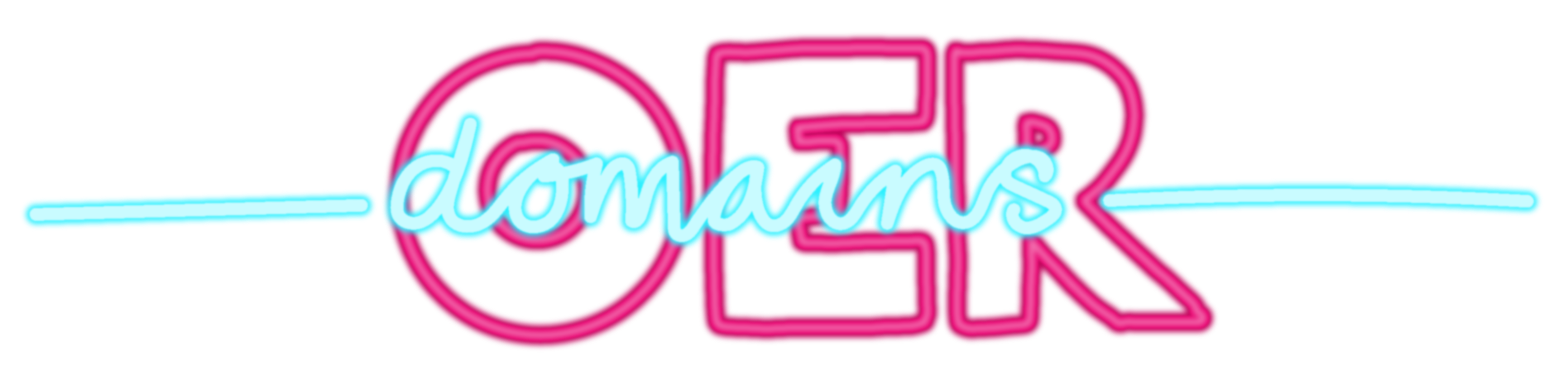
It also led to a whole other branch of neon awesomeness:
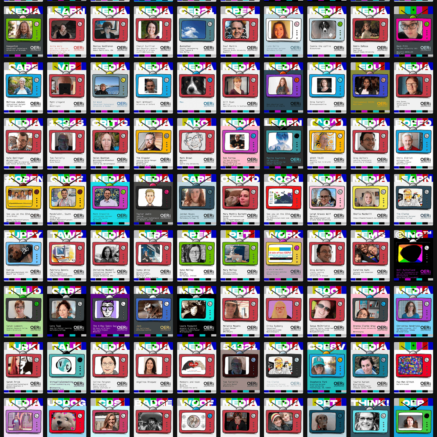
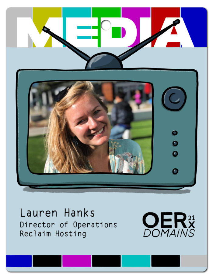
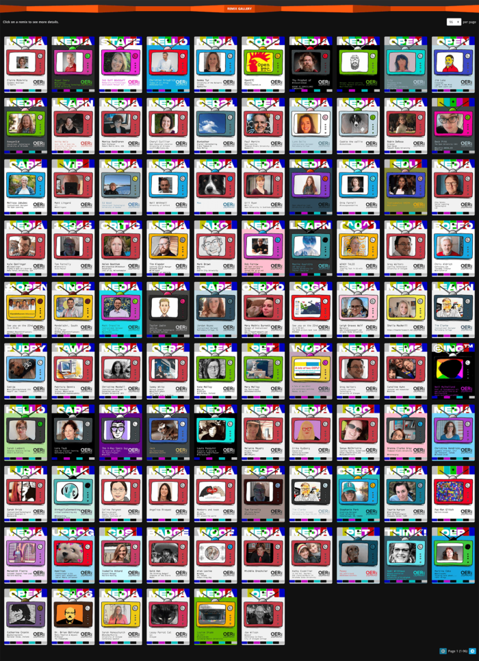
We wanted folks to create a virtual media badge to share when introducing themselves & talking about the conference. The community artwork that came as a result was gorgeous:
The OERxDomains21 ‘swag’ came next, naturally. (Items are still available for purchase on the shop page.)
And finally, just this morning I sat down with Jim and Maren to reflect on the vision for OERxDomains and so much more. Feel free to watch below:
I got my stickers today! I was showing them off to all my coworkers! Love the designs.